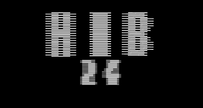
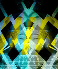
In connection to the series of initial ideas i also noted down elements that will be vital in the production of the final outcome. These graphic qualities included typography, colour,shape, style and imagery . Various features such as these will give my ideas more definition and focus when producing the final mock-ups/outcome. Firstly the use of typography will need to appear clean, rounded and representative of the company. Additionally various light toned blues will be used to create the television commercial. As well i intend to push forward the colour of yellow to emphasise the subject of corn and its strong relationship to it. Finally the overall appearance of the advert can appear organic in form such as screen-printed look or otherwise a refined photographic look. This will also relate to my idea of exploring various art styles such as abstract expressionism and modernist design.
Researching further into the brand and additional environmental texts provided me with a few slogans that could be used at the end of the advert..
WATER FOR THE WORLD
U+BELU BOTTLE SYMBOL = EARTH
MAINTAINING OUR WORLD
SUPPORTING THE FUTURE
Above is just a few slogans that could be possibly used for the outcome.
On my next post i will present further research that involves looking at Belu water's competitors and their advertising approach. This will include images from their website and various search engines.


No comments:
Post a Comment