After accessing my refined ideas i finally decided to select ieda 1 to develop and take further in terms if the design and look.
Chosen Idea;
use the idea of typography , the bottle and the use of environment together, punchy design. The bottle would come out of ground but using typography in the shape of the bottle, then actual bottle appear, words pour into bottle and person would pick up bottle drink goodness whilst various random thigns would enlighten the environment. then the person sees a ray in the ground and places the bottle on the ground whilst it decomposes,at the end the rainbow style logo appears in the sky , and the u+ belu water = earth, simple equation..
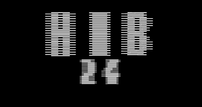
My main intention is to emphasise the importance of the environment and its use of corn. Additionally to raise awareness of this i will use corn field images and a visualisation of the action of biograding. Various parts of television will use typography to its great advantage. The appearance of the advert will look screen- printed more organic in colour, the text will be bold strong and look like the graphic works of Alan Kitchen. To develop these ideas i have drawn up a series of mock ups on paper , but also digital slides.
26.3.08
Subscribe to:
Post Comments (Atom)


No comments:
Post a Comment