USE OF FEAR ADVERTISING
EXAMPLE 3:
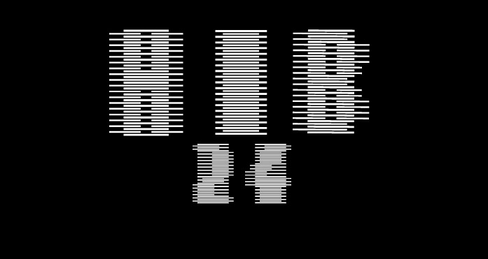
This image is a advert that was created to warn us on the people living within our society.Its approach is entirely different to the previous examples because its uses words to emphasise the overall message. The background image creates a vulnerability due to the empty space and also the first person view. By incorporating a emotion within both image and text, it has a sense of warning that we should be more aware of our surroundings.This emotive approach to a fearful advert has a inner message that somehow makes us think about the issue more seriously. Throughout this example it displays many features that involves careful planning and application. Firstly, the selective choice of image appears blurred, unfocused and represents a sense of feeling that your lost and unaware of whats around you. Additionally, the person in the image clearly presents this idea due to his pose. The use of typography has been positioned to the top left of the page to effectively bounce of the figure on the right. Using this method allows the viewer to understand the message immediately and complements the overall purpose. Moreover, the striking white text contrasts successfully against the photograph, to create a evident strong message. As a advert that uses fear to present its ideas, this poster clearly shows signs that possess a intention to fright the viewer.
On the whole, the overall presentation of this advert is made to re inact the moment as if your witnessing it. The main feature of this advert is the use of text, that clearly informs you about this issue. Without the text this advert wouldn't be easily understood and most probably be misunderstood.


No comments:
Post a Comment